Pattern

ImageImageBoth these pictures are of Hirst’s spot paintings. The one on the left is a normal one. The one on the right has an addition who some believe was made by Banksy, the graffiti artist. There is not too much on the individual paintings, however, I can tell you about Banksy. He is a United Kingdom based graffiti artist who was also born in The UK. Little to none know his true identity, but people will not stop searching.

I think this is a good example of pattern. Especially in the picture on the left, the pattern is the main focus. The simplicity of it makes it look really enticing. This pattern is not overly complex, but the color makes it intriguing. If it was all in black and white, it would be extremely boring. Pattern is an element of art that benefits greatly from other elements of art and principles of design.

Rhythm

ImageThis painting was done by Minnie Pwerle, mother of more known artist, Barbara Weir. This piece was drawn to my eye because of its simplicity. The simple combining of lines can create such beauty. There is really not too much on this piece, but I do know a little bit about the artist. Pwerle recently died in 2006, but she did this painting when she was in her 70’s or 80’s. Her daughter was taken away from her when Barbara was 9 to be an “indentured laborer” for a white man. They did find each other again years later. I think this is a great inspirational story to tell. 

I think this is a good example of rhythm. The repeating of lines, shapes and color create a visual “beat” in the painting. There are different “tempos”, just like in music, but it all has the same rhythm. When something changes, something else stays the same. For example, if color changes, the lines stay the same. Not changing too many things at once keeps the same rhythm.

Shape

ImageThis picture was painted by Bruce Gray. He was born in 1956 in Orange, New Jersey. This painting was done in 2001 with acrylic on canvas. This is what one would consider modern art. This piece is entitled Raindrops#4. I really enjoy this painting because of how colorful it is.

I believe this is a good example of shape. There are so many shapes in this painting that it would be a pain in the neck to count them all. There aren’t any full circles that are all the same color, but they appear that way because of all the “pieces” placement. The different shapes draw your eyes all over the picture. I used to do drawings like this when I was young and I really like seeing what one looks like when it’s completed.

Form

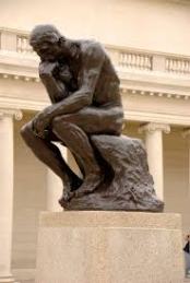
ImageThis sculpture,The Thinker was created by François-Auguste-René Rodin, more commonly called Auguste Rodin, in 1902. Rodin was born on November 12, 1840 in Paris, France. He was a French sculptor who lived in the Impressionism and Modern Art era. This sculpture has been recreated many, many times. 1880 was the first time he finished the cast but the first large-scale bronze casting was not finished until 1902. I do not know when the one above was created, however it is still a great piece of art. Rodin died on  November 17, 1917 in Meudon, France.

I think this is a good example of form. Form is shown in all three dimensional objects and some paintings and drawings have the illusion of form. Since all real sculptures are three dimensional, I could have chosen any sculpture. However, I wanted to choose one that people would know. The Thinker was seen in Night of the Museum Two: Battle of the Smithsonian. I think it’s cool that when artwork is seen in everyday things like movies, people appreciate more than when in the classroom. 

Space

ImageThis painting entitled The Fallen Jockey was painted by Edgar Degas. He was born on July 19, 1834 in Paris, France. He worked mainly in the Impressionism, Modern Art and Realism era. A lot of his work was in painting people, more specifically, dancers. He also made sculptures, prints, and drawings. He died on September 27, 1917 in Paris France.

I believe this is a good example of space. Space is the distance between objects. In his picture, space is important because Edgar was trying to make it look as realistic as possible. When you fall off a horse, the space between you and the horse increases with time. In this picture, the space also increases to make it more lifelike.

Contrast

Image This painting was done by Claude Monet. He was born on November 14, 1840 in Paris, France. He worked in the Impressionism and Modern Art era. Monet did a lot of landscapes while enjoying the nature scene in front of him. He died on  December 5, 1926 in Giverny, France. He is one of the most known artist in history.

I think this is a good example of contrast. Since the whole sky is colored, and the buildings are black, they stand out. Contrast is a good way to get things to pop out. When things don’t all blend together, it’s easier to focus on one major object. Contrast is one of the easiest ways to emphasize something.

Unity

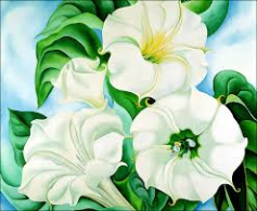
ImageThis picture was painted by Georgia O’keeffe. She was born on November 15, 1887 near Sun Prairie, Wisconsin. Most of her work was done with paints. The subjects of most of her work are flowers and plants. In 1929, She moved to Santa Fe, New Mexico. She died on  March 6, 1986, when she was 98 years old.

I think this is a good example of unity. Unity is when all the pieces of the artwork go together. These are all flowers. If a robot was in there, for example, the piece would not have unity. Since these “pieces” go together, O’keeffe has mastered unity in the picture.

Line

ImageThis painting was done by Pablo Picasso. Picasso was born on October 25, 1881, Malaga, Spain. His full name was Pablo Diego José Francisco de Paula Juan Nepomuceno María de los Remedios Cipriano de la Santísima Trinidad Ruiz y Picasso. He was a Spanish sculptor, painter, printmaker, ceramicist, stage designer, poet and playwright. He did a lot of abstract paintings in his lifetime. He died on April 8, 1973, in Mougins, France. He was truly an amazing artist.

I think this is a good example of line. Most of Picasso’s work was in abstract. Abstract relies on lines to work. The lines seem to break up the painting and makes it look unrealistic; which was his goal. He didn’t want his works to be super lifelike, so he used line in a way that some would say is incorrect, but it came out just the way he wanted it.


Value

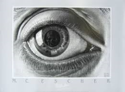
ImageThis drawing was done by Maurits Cornelis Escher or M.C. Escher. He was born on June 17, 1898 in Leeuwarden, Netherlands. He worked in the modern art era and made a lot of optical illusions. This particular masterpiece was drawn in 1946. He also made woodcuts and lithographs. He died on March 27, 1972 in Laren, Netherlands.Little fun fact, almost if not all drawings in the back of the art room are by Escher.  

I think this is a good example of value. Since it is in black and white, you can easily see all the reflections and highlights. There is a gradual increase from black to white. Since the difference is so subtle, it makes the art appear more realistic. I also like the shadows in the creases of the eyelids and how they look extremely lifelike. I enjoy the subject of the drawing as well. An everyday object that no one really thinks about focusing on. It emphasizes the artistic talent used.

Balance

Image

This piece, entitled The Creation of Adam, was painted by Michelangelo di Lodovico Buonarroti Simoni, more commonly known today as Michelangelo. He was born on March 6, 1475 in Caprese Michelanglo, Italy. This painting was painted in 1511-1512 on the ceiling of the Sistine Chapel. This picture 280cm by 570cm or 9ft 2in by18ft 8 in. This type of painting is called a fresco. It is one of the most replicated biblical paintings of all time.

This is a good example of balance. If you were to split this picture down the middle, it would have about the same amount of visual activity on both sides. There is more detail on the right side of the picture, but the main focus of the picture (the people), is visually balanced. They “weigh” about the same amount.